Box Plot Alternatives: Beeswarm and Violin Plots
Box plots are great as they do not only indicate the median value but also show the variation of the measurements in terms of the 1st and 3rd quartiles. There are, however, also plots that provide a bit of additional information. Here, we take a closer look at potential alternatives to the box plot: the beeswarm and the violin plot.
The beeswarm plot
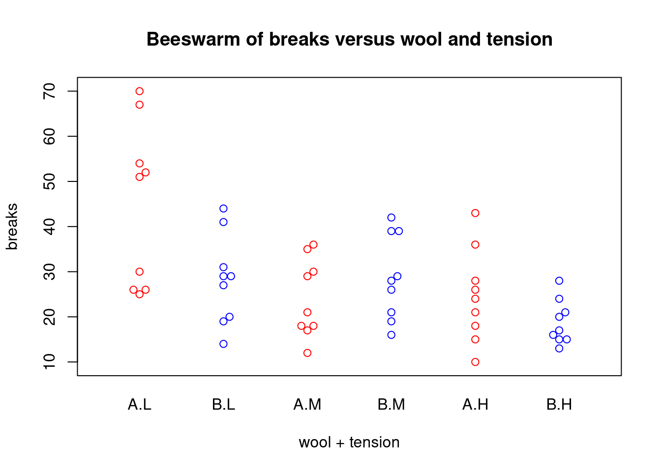
An implementation of the beeswarm plot is available via the beeswarm package. In principle, the beeswarm plot resembles a one-dimensional scatter plot because it displays individual measurements as points. The difference, however, is that the beeswarm plot applies a logic ensuring that plotted points are close to each other and do not overlap.
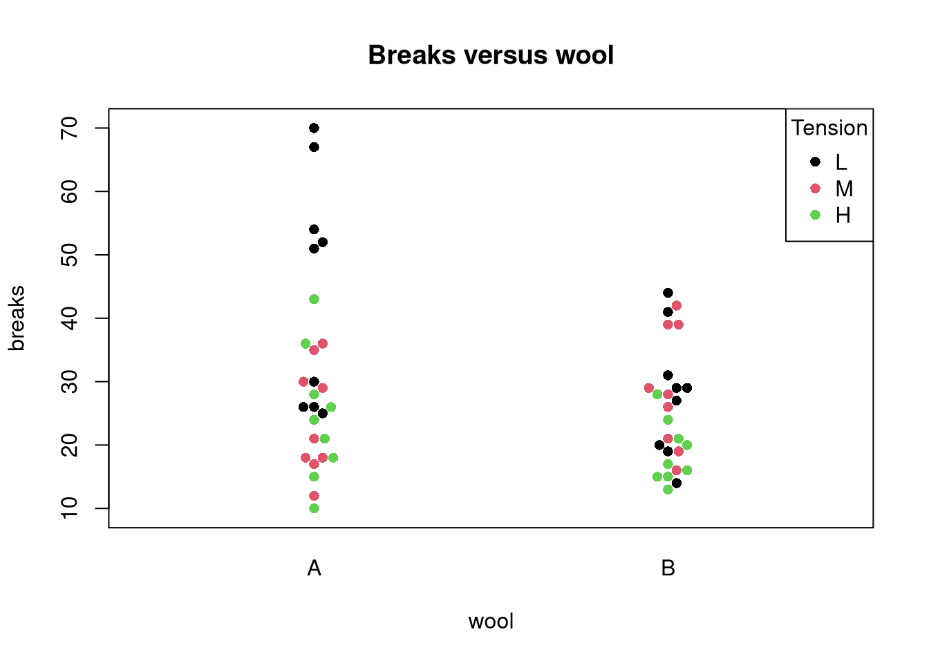
So, when should you use a beeswarm plot? Since the points in a beeswarm plot should not overlap, this type of plot is only suitable for a relatively small number of measurements. They are also suitable if measurements exhibit different groups because individual points can be colored accordingly.
Using the beeswarm plot in R
We will use the warpbreaks data set to exemplify the use of the plot.
data(warpbreaks)
library(beeswarm)
# option 1: color by group
beeswarm(breaks ~ wool + tension, data = warpbreaks,
    main = "Beeswarm of breaks versus wool and tension",
    col = rep(c("red", "blue"), 3))
# option 2: color individual points
beeswarm(breaks ~ wool, data = warpbreaks,
    main = "Breaks versus wool",
    pwcol = as.numeric(tension), pch = 16)
legend("topright", legend = levels(warpbreaks$tension),
       title = "Tension", pch = 16, col = 1:3)
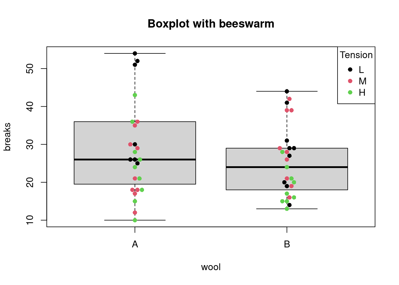
The beeswarm plot can also be combined with a box plot in the following way:
boxplot(breaks ~ wool, data = warpbreaks,
        main = "Boxplot with beeswarm",
    # do not duplicate outliers:
    outline = FALSE)
beeswarm(breaks ~ wool, data = warpbreaks,
    main = "Beeswarm of breaks versus wool", add = TRUE,
    pwcol = as.numeric(tension), pch = 16)
legend("topright", legend = levels(warpbreaks$tension),
       title = "Tension", pch = 16, col = 1:3)
The violin plot
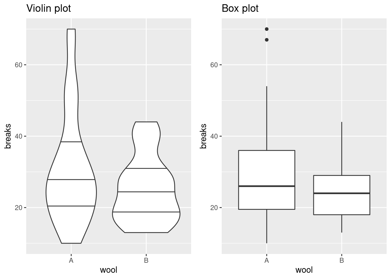
The idea of a violin plot is to combine a box plot with a density plot. Since it relies on density estimation, the plot only makes sense if a sufficient number of data are available for obtaining reliable estimates. Otherwise, the estimated densities may indicate trends that are not really in the data.
Creating a violin plot in R
To demonstrate how a violin plot is different from a box plot, compare the following two representations:
library(ggplot2)
require(gridExtra)
p.violin <- ggplot(warpbreaks, aes(x = wool, y = breaks)) +
    # add horizontal lines at Q1, Q2, and Q3
    geom_violin(draw_quantiles = c(0.25, 0.5, 0.75)) +
    ggtitle("Violin plot")
p.box <- ggplot(warpbreaks, aes(x = wool, y = breaks)) +
    geom_boxplot() + ggtitle ("Box plot")
grid.arrange(p.violin, p.box, ncol = 2)
In this case, we see the limitation of the violin plot for small sample sizes (hint: the limitation is not that the plot does not seem to show violins but vases). The violin for wool A stretches up to the outliers at a value of 65 indicating. Since the width is similar at values 40 and 60, one could think that there are many such measurements. The box plot, on the other hand, reveals that there are indeed only two measurements with a value greater than 60.


Comments
Wilbert
16 Apr 20 12:50 UTC
Nice article! The problem observed at the end of this article can be solved by changing the bandwidth using the parameter ‘adjust’ in ‘geom_violin’:
geom_violin(draw_quantiles = c(0.25, 0.5, 0.75), adjust = .5)