Radar plots
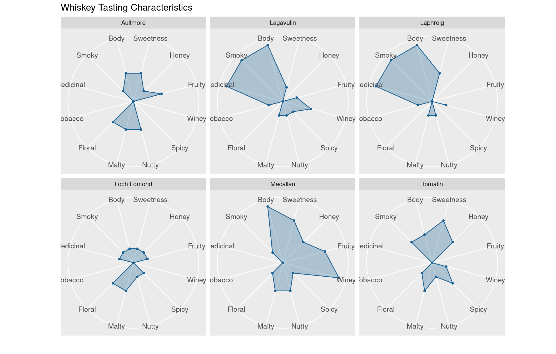
Radar plots visualize several variables using a radial layout. This plot is most suitable for visualizing and comparing the properties associated with individual objects. In the following, we will use a radar plot for comparing the characteristics of whiskeys from different distilleries.
A data set on whiskey
Some of you may already know that radar plots are well-suited for visualizing whiskey flavors. I saw this type of visualization first, when I visited the Talisker distillery, the only whiskey distillery on the Isle of Skye. Here, we will try to reproduce this type of visualization.
For this purpose, I have retrieved a data set on whiskey flavor profile from the University of Strathclyde. To load the data from the web, we will use the RCurl library:
library(RCurl)
# load data as character
f <- getURL('https://www.datascienceblog.net/data-sets/whiskies.txt')
# read table from text connection
df <- read.csv(textConnection(f), header=T)
Next, we take a look at the data:
head(df)## RowID Distillery Body Sweetness Smoky Medicinal Tobacco Honey Spicy Winey
## 1 1 Aberfeldy 2 2 2 0 0 2 1 2
## 2 2 Aberlour 3 3 1 0 0 4 3 2
## 3 3 AnCnoc 1 3 2 0 0 2 0 0
## 4 4 Ardbeg 4 1 4 4 0 0 2 0
## 5 5 Ardmore 2 2 2 0 0 1 1 1
## 6 6 ArranIsleOf 2 3 1 1 0 1 1 1
## Nutty Malty Fruity Floral Postcode Latitude Longitude
## 1 2 2 2 2 \tPH15 2EB 286580 749680
## 2 2 3 3 2 \tAB38 9PJ 326340 842570
## 3 2 2 3 2 \tAB5 5LI 352960 839320
## 4 1 2 1 0 \tPA42 7EB 141560 646220
## 5 2 3 1 1 \tAB54 4NH 355350 829140
## 6 0 1 1 2 KA27 8HJ 194050 649950The most important observation is that the caracteristics of whiskeys are identified by numbers ranging from 0 (low expression of a characteristic) to 4 (high expression of a characteristic).
Next, we need to select some features for plotting. Here, we simply specify all of the whiskey characteristics stored in the data set:
features <- c("Sweetness", "Honey", "Fruity",
              "Winey", "Spicy", "Nutty", "Malty",
              "Floral", "Tobacco", "Medicinal",
              "Smoky", "Body")
df <- df[, c("Distillery", features)]
Creating a radar plot in R
To create a radar plot, we will use ggiraphExtra as well as ggplot2. For ggiraphExtra to work, we need to have udunits2 installed. If apt-get is your package manager, you can install the udunits2 library via
apt-get install libudunits2-devOnce libudunits2 is available and ggiraphExtra is successfully installed, we can create the radar plot:
library(ggiraphExtra)
library(ggplot2)
# select a random sample of whiskeys
i <- sample(seq_len(nrow(df)), 6)
# select some whiskeys I know
my.whiskeys <- c("Aultmore", "Loch Lomond", "Lagavulin", "Tomatin", "Laphroig", "Macallan")
plot.df <- df[which(df$Distillery %in% my.whiskeys),]
mycolor <- "#1c6193"
p <- ggRadar(plot.df, aes(group = Distillery),
     rescale = FALSE, legend.position = "none",
     size = 1, interactive = FALSE, use.label = TRUE) +
     facet_wrap(~Distillery) +
     scale_y_discrete(breaks = NULL) + # don't show ticks
    theme(axis.text.x = element_text(size = 10)) + # larger label sizes
    # adjust colors of radar charts to uniform colors
    scale_fill_manual(values = rep(mycolor, nrow(plot.df))) +
    scale_color_manual(values = rep(mycolor, nrow(plot.df))) +
    ggtitle("Whiskey Tasting Characteristics")
print(p)
Interpreting the radar plot
Using the radar plot we created, we can compare the characteristics of the six whiskeys that are visualized. Whiskeys from a similar region often share a similar taste profile. The six selected whiskeys comoe from the following regions:
- Speyside: Aultmore, Macallan
- Islay: Lagavulin, Laphroig
- Highlands: Loch Lomond, Tomatin
For example, whiskeys from Islay are characterized by their smokiness and their medicinal taste, which is a result of excessive use of peat during the malting process. As a consequence, whiskeys from the Laphroig and and Lagavulin distilleries have similarly radar profiles for these characteristics.
We can also the size of the radar surface area to gauge the quality of whiskeys. For example, Loch Lomond is known for producing rather cheap whiskey that do not have a very distinct flavor profile. The other distilleries are known for a greater quality, which becomes evident from their rather distinct flavor profiles. For example, Mcallan has a strong body that is characterized by fruitiness, sweetness, and a resemblance of wine.
Creating an overview of all whiskeys
To visualize all of the available 86 whiskeys, I slightly adjusted the code:
p <- ggRadar(df, aes(group = Distillery),
     rescale = FALSE, legend.position = "none",
     size = 1, interactive = FALSE) +
     facet_wrap(~Distillery, ncol = 4) +
     scale_y_discrete(breaks = NULL) +
    theme(axis.text.x = element_text(size = 10)) +
    scale_fill_manual(values = rep(mycolor, nrow(df))) +
    scale_color_manual(values = rep(mycolor, nrow(df))) +
    ggtitle("Whiskey Tasting Characteristics") +
    # center title, increase facet strip text size, increase title size
    theme(plot.title = element_text(size = 40, hjust = 0.5),
          strip.text.x = element_text(size = 20))
And finally, stored the plot with:
ggsave("whiskey-tasting-characteristics.png", p, units = "cm",
       height = 250, width = 50, limitsize = FALSE)


Comments
There aren't any comments yet. Be the first to comment!