Dimensionality Reduction for Visualization and Prediction
Dimensionality reduction has two primary use cases: data exploration and machine learning. It is useful for data exploration because dimensionality reduction to few dimensions (e.g. 2 or 3 dimensions) allows for visualizing the samples. Such a visualization can then be used to obtain insights from the data (e.g. detect clusters and identify outliers). For machine learning, dimensionality reduction is useful because oftentimes models generalize better when fewer features are used during the fitting process.
In this post, we will investigate three dimensionality reduction techniques:
- Principal components analysis (PCA): the most popular dimensionality reduction method
- Kernel PCA: a variant of PCA that allows for nonlinearity
- t-distributed stochastic neighbor embedding: a recently developed nonlinear dimensionality reduction technique
A key difference between these approaches is that PCA outputs a rotation matrix, which can be applied on any other matrix in order to transform the data. Neighborhood-based techniques such as t-distributed stochastic neighbor embedding (t-SNE), on the other hand, cannot be used for this purpose.
Loading a whiskey data set
I have previously described a data set on whiskeys. We can load the data set in the following way:
library(RCurl)
# load data as character
f <- getURL('https://www.datascienceblog.net/data-sets/whiskies.csv')
# read table from text connection
df <- read.csv(textConnection(f), header=T)
# select characterics of the whiskeys
features <- c("Body", "Sweetness", "Smoky",
            "Medicinal", "Tobacco", "Honey",
            "Spicy", "Winey", "Nutty",
            "Malty", "Fruity", "Floral")
feat.df <- df[, c("Distillery", features)]
Assumptions about the results
Before we begin reducing the dimensionality of the data, we should think about the data. We would expect that whiskeys with similar taste profiles are close to each other in the reduced space.
Since whiskeys from distilleries that are in proximity to another use similar distilling techniques and resources, their whiskeys also share similarities.
To validate this assumption, we are going to test whether the mean expression of whiskey characteristics differ between distilleries from different regions. For this, we will run a MANOVA test:
m <- manova(as.matrix(df[, features]) ~ Region, df)
summary(m)## Df Pillai approx F num Df den Df Pr(>F)
## Region 5 1.2582 2.0455 60 365 3.352e-05 ***
## Residuals 80
## ---
## Signif. codes: 0 '***' 0.001 '**' 0.01 '*' 0.05 '.' 0.1 ' ' 1The test statistic is significant at the 5% level, so we can reject the null hypothesis (there is no effect of region on the characteristics). This means that an appropriate dimensionality reduction should preserve the geographical proximity of the distilleries to some extent.
Geographical locations of the distilleries
Since regionality plays an important role for whiskeys, we will explore where the distilleries in the data set are located by plotting their latitude and longitude. The following Scotch whiskey regions exist:
Scotch regions (Licensed under CC BY-SA 3.0 and retrieved from https://commons.wikimedia.org/wiki/File:Scotch_regions.svg)
Fortunately, we have already mapped Latitude and Longitude from UTM coordinates to degrees before. Therefore, we can now directly plot the locations of the distilleries using the lat and long variables:
library(ggplot2) # for map_data and ggplot functions
library(ggrepel) # for geom_text_repel: smart text labels
uk.map <- map_data ("world", region = "UK")
scotland.map <- uk.map[uk.map$subregion == "Scotland",]
p <- ggplot(data = scotland.map, aes(x = long, y = lat)) +
geom_map(map = uk.map,
       aes(map_id = region),
       fill="white", colour = "black") +
coord_map() +
geom_point(data = df, aes(y = long, x = lat, color = Region),
     alpha = .75) +
ggtitle ("Locations of Scottish Whiskey Distilleries")
# for storing the map with labels:
#geom_text_repel(data = map.df, aes(y = long, x = lat, label = Distillery))
# ggsave(file.path("distillery_map.png"), p, units = "cm", height = 80, width = 80)
p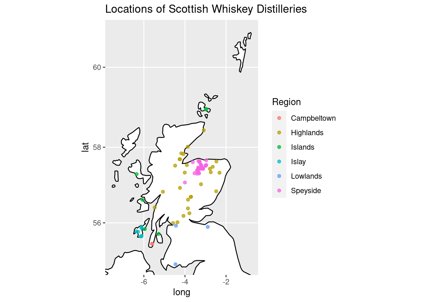
I also created a high-resolution version of the distillery map where the labels of the distilleries are annotated.
PCA
PCA computes a rotation matrix W∈Rp×p from the matrix of features X∈RN×p. W can be understood as a mapping function that transforms the observations in X to a rotated space. The coordinates of observations in X are transformed to their new form, Z, via
Z=XW.
The rotation matrix W is constructed through orthogonal linear transformations. Each of these transformations is performed in order to maximize the variance in the data that has not been explained yet. This procedure leads to a new coordinate system in terms of principal components.
One of the reasons why PCA is so popular is that it is a very interpretable method. Each principal component (PC) is well-defined as we know that it is orthogonal to the other dimensions. Moreover, we can obtain the variance that is explained by each PC in order to select an appropriate number of dimensions.
Visualizing the whiskey data set using PCA
PCA is normally performed using the prcomp function. Here, we use autoplot instead because we are primarily interested in the visualization. In addition to PCA, we call the pam function, which performs partitioning around medoids, which is a more robust version of k-means. In the first plot we create, we will draw the loadings of PCA, which are defined as
L=v√λ
where L are the loadings, v are the eigenvectors, and λ are the eigenvalues. The loadings indicate the directions of variance from the original features:
library(ggfortify) # for autplot support for the clustering
library(cluster) # for pam
data <- df[,features]
rownames(data) <- paste0(df$Distillery, " (", df$Region, ")")
cl <- pam(data, 3)
# learn about the interpretation of the principal componenets:
autoplot(cl, frame = TRUE, frame.type = 'norm', loadings.label = TRUE,
loadings.colour = "black", loadings.label.colour = "black")## Warning: `select_()` is deprecated as of dplyr 0.7.0.
## Please use `select()` instead.
## This warning is displayed once every 8 hours.
## Call `lifecycle::last_warnings()` to see where this warning was generated.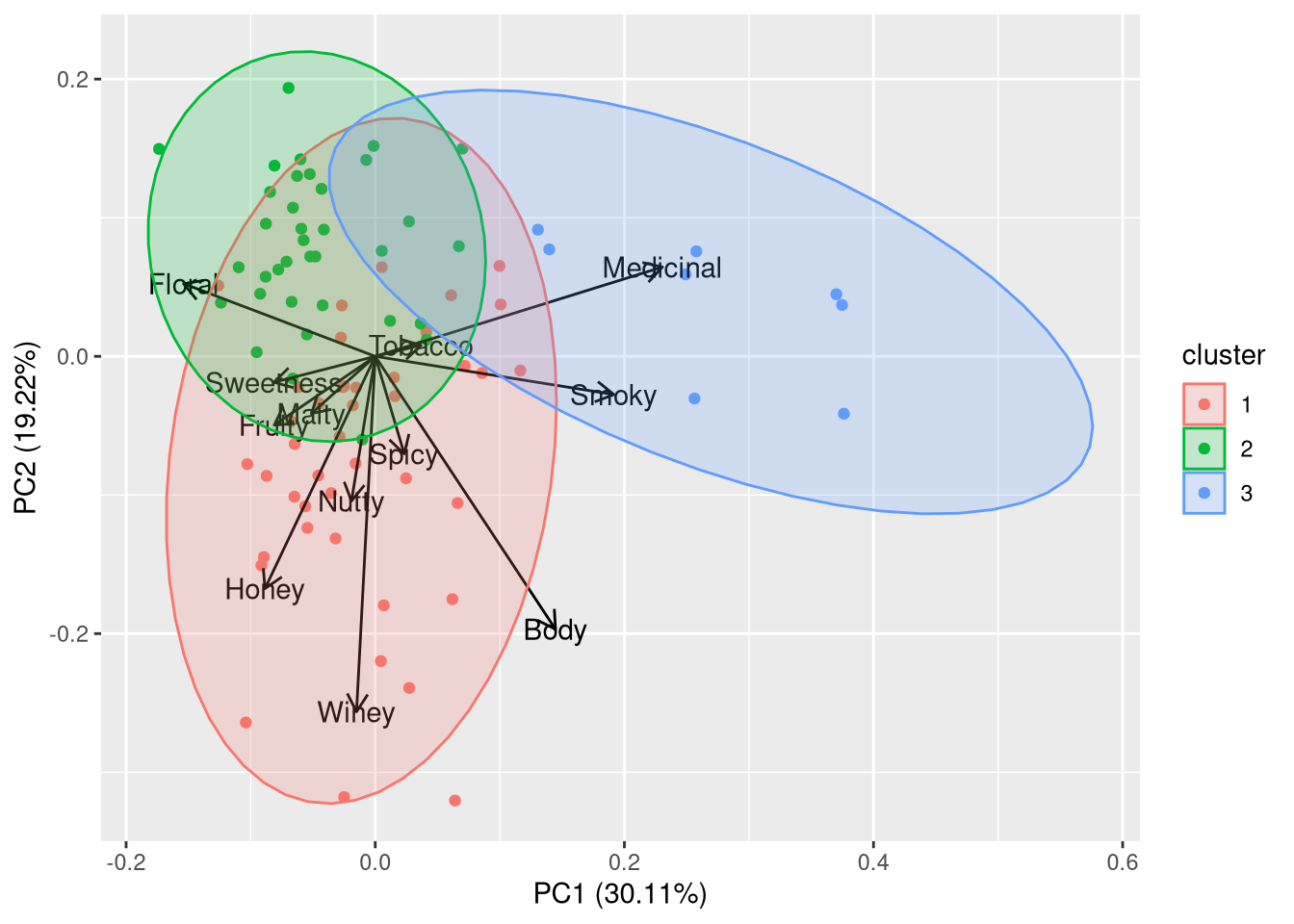
In the second plot, we will draw the labels of the distilleries such that we can interpret the clustering in more detail.
autoplot(cl, frame = TRUE, frame.type = 'norm', label.repel = TRUE,
         label = TRUE, label.colour = "black", shape = FALSE)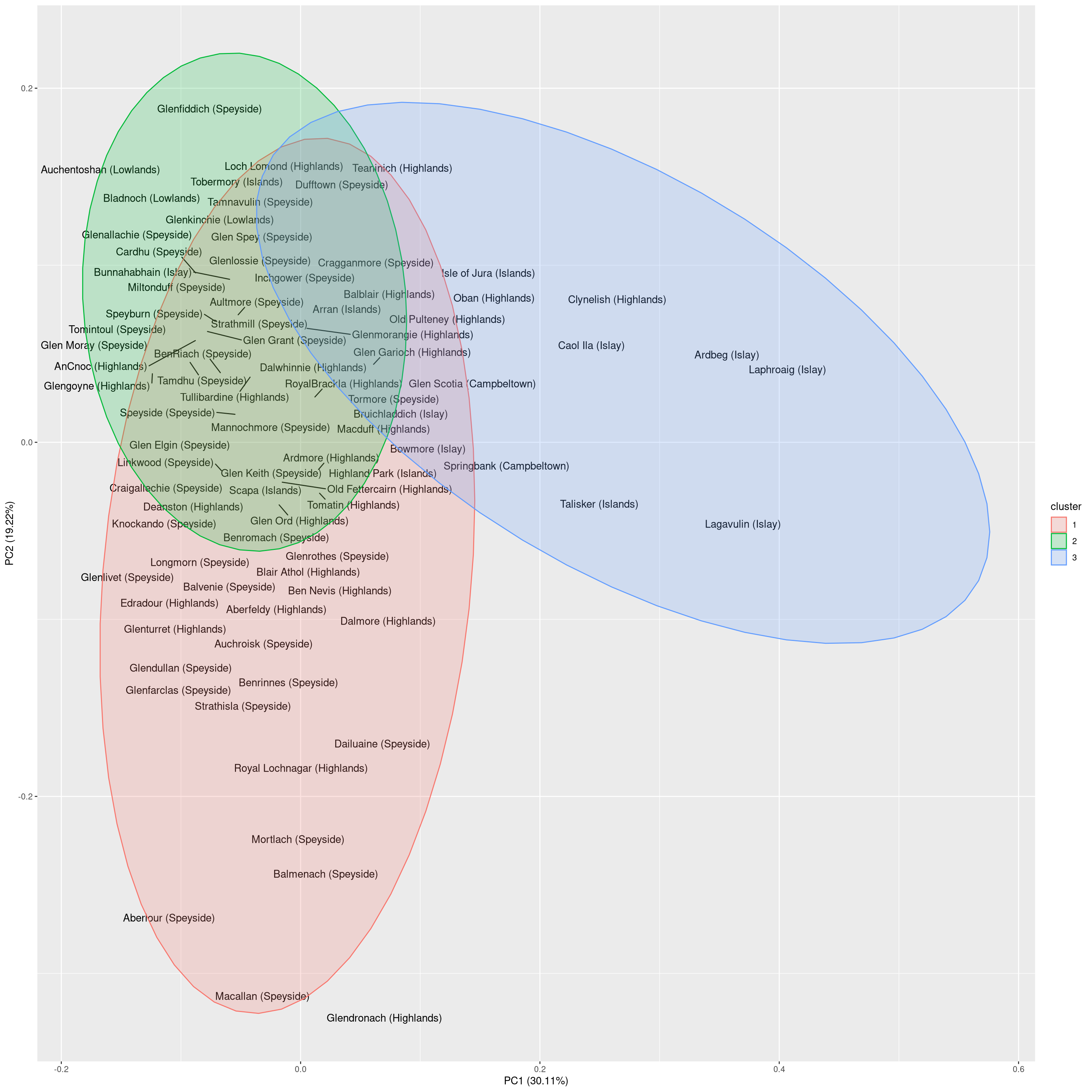
Taken together, the principal components seem to reflect the following characteristics:
- PC1 indicates the intensity of the taste: i.e. a smoky, medicinal taste (e.g. Laphroaig or Lagavulin) vs a smooth taste (e.g. Auchentoshan or Aberlour)
- PC2 indicates the complexity of the taste: i.e. a well-balanced taste profile (e.g. Glenfiddich or Auchentoshan) vs a more characteristic taste profile (e.g. Glendronach or Macallan)
Let us verify whether the clusters actually overrepresent certain regions:
tabs <- vector("list", 3)
for (i in seq(3)) {
    idx <- which(cl$clustering == i)
    regions <- df$Region[idx]
    tabs[[i]] <- table(regions)
}
cluster.df <- data.frame("Cluster" = 1:3, do.call(rbind, tabs))## Warning in (function (..., deparse.level = 1) : number of columns of result is
## not a multiple of vector length (arg 3)print(cluster.df)## Cluster Campbeltown Highlands Islands Islay Speyside
## 1 1 2 17 2 2 19
## 2 2 8 2 1 3 22
## 3 3 2 2 4 2 2Indeed, each cluster exhibits one region that is overrepresented. A reasonable interpretation of the clusters is as follows:
- Cluster 1: Complex whiskeys, mostly from the Highlands/Speyside
- Cluster 2: Well-balanced whiskeys, mostly from Speyside and Highlands
- Cluster 3: Smoky whiskeys, mainly from Islay
There are two interesting observations to be made from the visualization:
- Oban and Clynelish are the only Highlands distilleries that produce tastes resembling those from distilleries on Islay.
- Highland and Speyside whiskeys differ mainly in one dimension. At the one extreme are the smooth, well-balanced whiskeys such as Glenfiddich. At the other extreme, are the whiskeys with a more characteristic taste such as Macallan.
This wraps up our investigation of PCA for visualization. We will investigate the use of PCA for prediction at the end of this post.
Kernel PCA
Kernel PCA (KPCA) is an extension of PCA that makes use of kernel functions, which are well known from support vector machines. By mapping the data into a reproducing kernel Hilbert space, it is possible to separate data even if they are not linearly separable.
In KPCA, observations are transformed to a kernel matrix via
K=k(x,y)=ϕ(x)Tϕ(y)
where k(x,y) is the kernel function for observations x and y. The function ϕ maps the observations into reproducing kernel Hilbert space. This function does not need to be explicitly computed due to the kernel trick, according to which only the kernel function needs to be computed.
Using KPCA in R
To perform KPCA, we use the kpca function from the kernlab package. By default, kpca uses a radial basis function (RBF) as a kernel when a matrix is provided although other kernel functions are available as well. The RBF kernel that is used by kernlab is defined as
K(x,y)=exp(−σ−||x−y||2)
where σ is the inverse kernel width. Using this kernel, the dimensionality reduction can be done as follows:
library(kernlab) # for kpca function
# use the default of sigma = 0.1 because it works well
pca.k <- kpca(as.matrix(data), kpar = list(sigma = 0.1))
plot(pca.k@eig) # eigenvalues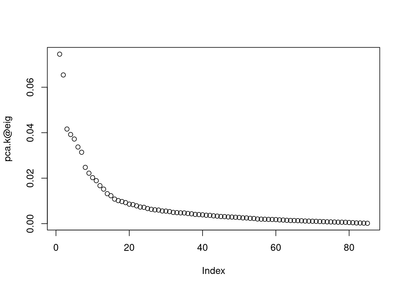
# select 20 dimensions for prediction according to eigenvalues
n.dim.model <- 20
# retrieve PCs
pc <- pca.k@pcv
Having retrieved the new dimensions, we can now visualize the data in the transformed space:
library(ggrepel) # for geom_text_repel
kpca.df <- data.frame("Label" = df$Distillery, "Region" = df$Region,
                      "PC1" = pc[,1], "PC2" = pc[,2])
ggplot(kpca.df, aes(label = Label, x = PC1, y = PC2, color = Region)) +
    geom_text_repel()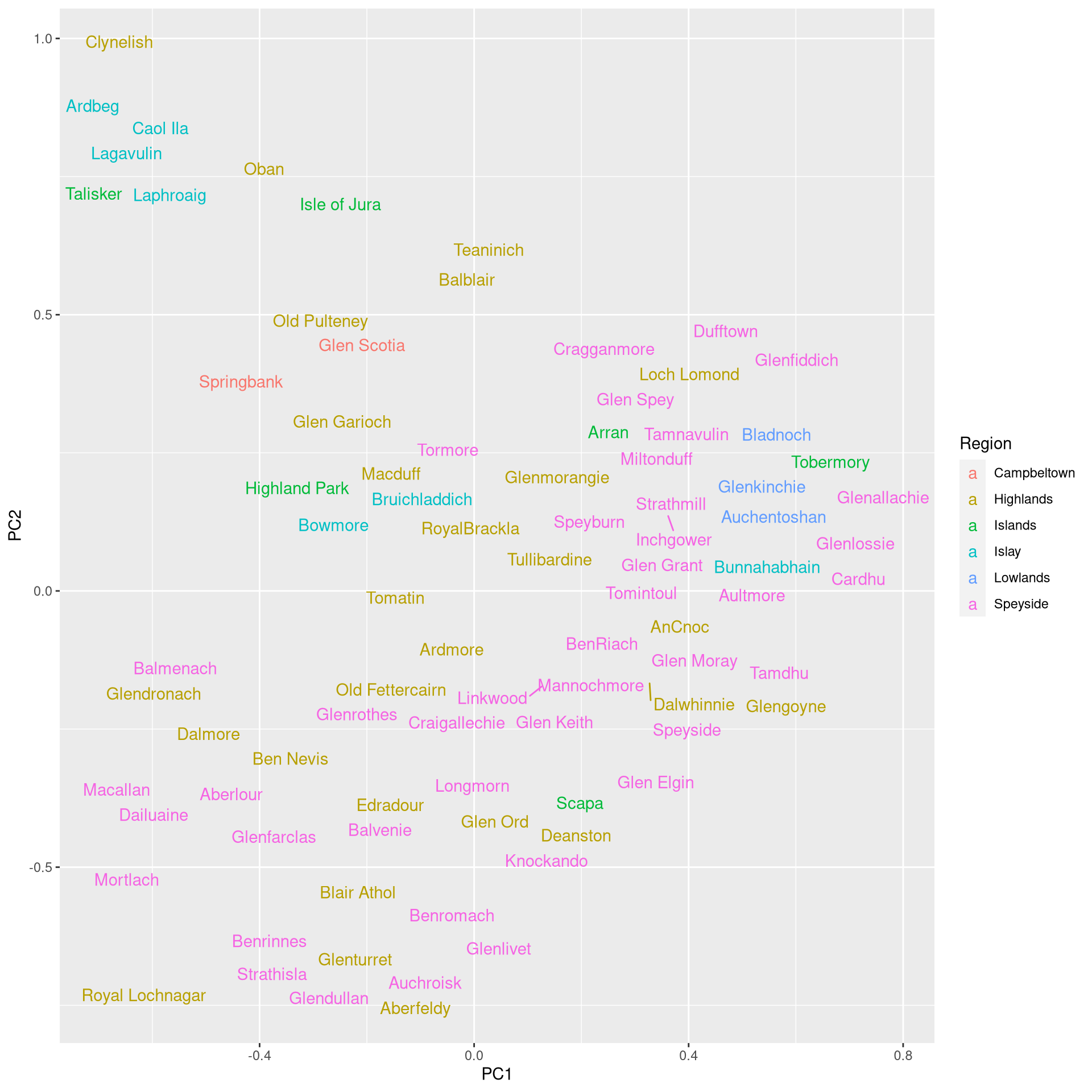
In terms of the visualization, the results are a bit coarser than what we have obtained with conventional PCR. Still, the whiskeys from Islay are well-separated and we can see a cluster of Speyside whiskeys, while the Highlands whiskeys are highly spread throughout.
A disadvantage of KPCA is that you need to deal with the hyperparameters of the kernel functions: these need to be tuned to the data. Moreover, KPCA is not as interpretable as PCA because it is not possible to determine how much variance is explained by individual dimensions.
t-SNE
t-SNE was introduced in 2008. Since then it has established itself as a very popular method for visualizing data. t-SNE performs two algorithmic steps. First, a probability distribution P over pairs of samples is constructed. This distribution assigns high probabilities of selection to similar pairs and low probabilities to dissimilar pairs.
The P distribution is constructed in the following way. Given two feature vectors xi and xj, the probability of xj given xi is defined by
pj∣i=exp(−‖xi−xj‖2/2σ2i)∑k≠iexp(−‖xi−xk‖2/2σ2i)
such that the probability of selecting the pair xi, xj is
pij=pj∣i+pi∣j2N.
The probabilities for i=j are set to pij=0.
The bandwidth of the Gaussian kernel σ is set such that the perplexity of the conditional distribution assumes a predefined value. Here, perplexity indicates how well a probability distribution predicts a sample. You can think of perplexity as a measure of surprise. If a model is not appropriate for a test sample, it will be perplexed (it does not fit the sample), while a model that fits well will have low perplexity. To reach the target perplexity, the bandwidth σi is adjusted to the density of the data.
To construct a d-dimensional map yi,…,yN where yi∈Rd, the second phase of the algorithm defines the second distribution Q through similarities qij between two points yi, yj in the map:
qij=(1+‖yi−yj‖2)−1∑k≠l(1+‖yk−yl‖2)−1.
The qij follow Student’s t-distribution. Again, qij=0 for i=j.
To determine the yi, the Kullback Leibler divergence between the distributions Q (y similarities) and P (x similarities) is minimized:
KL(P||Q)=∑i≠jpijlogpijqij
Selecting a perplexity
In t-SNE, perplexity balances local and global aspects of the data. It can be interpreted as the number of close neighbors associated with each point. The suggested range for perplexity is 5 to 50. Since t-SNE is probabilistic and also has the perplexity parameter, it is a very flexible method. However, this may make one a bit suspicious about the results. Note that t-SNE is not suitable for settings such as supervised learning because the resulting dimensions lack interpretability.
Visualizing data using t-SNE
Using R, t-SNE can be performed by loading the Rtsne function from the package with the same name. Here, we reduce the dimensionality of the whiskey data set to two dimensions:
library(Rtsne)
set.seed(1234) # reproducibility
tsne <- Rtsne(data, dims = 2, perplexity = 5)
t.df <- as.data.frame(tsne$Y)
colnames(t.df) <- c("V1", "V2")
t.df <- cbind(t.df, Cluster = factor(cl$clustering))
t.df$Distillery <- rownames(t.df)
ggplot(t.df, aes(x = V1, y = V2, color = Cluster, label = Distillery)) +
    geom_text_repel()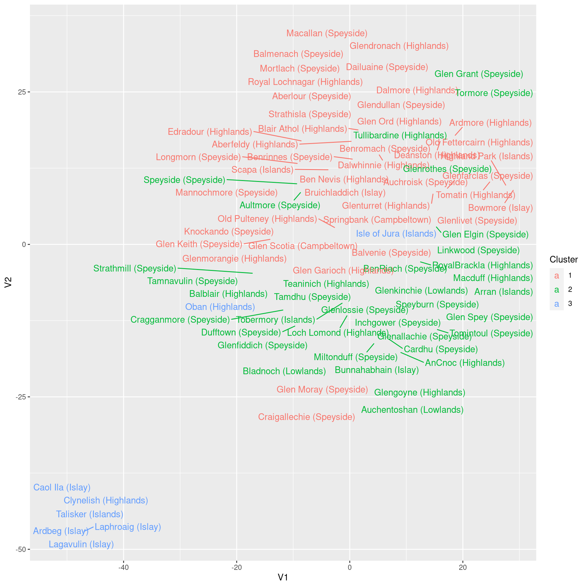
The result of the dimensionality reduction obtained with t-SNE is impressive. The separation of the clusters is even clearer than with PCA, particularly for clusters 1 and 2.
Interpretation, however, is a bit more tedious with t-SNE. Using PCA, we made use of the loadings to gain insights about the principal components. For t-SNE dimensions, we have to do the interpretation manually:
- V1 indicates taste complexity. The outliers here are the smoky Islay whiskeys on the right hand side (e.g. Lagavulin) and the complex Highland whiskeys on the left (e.g. Macallan).
- V2 indicates smokiness/medicinal taste. Again, the whiskeys from Islay are the the smoky extreme, while some Highlands/Speyside whiskeys (e.g. Tullibardine or Old Fettercairne) are the other extreme.
Using PCA for supervised learning
It is crucial that PCA is done independently for the training and test data sets. Why? If PCA were performed on the whole data set, the orthogonal projection obtained via PCA would be influenced by the test data. Thus, when testing the performance of the model on the test data, the performance of the model would be overestimated since the projection is tuned to the space in which the test samples reside. Thus, the following approach needs to be followed:
- Perform PCA on the test data set and train the model on the transformed data.
- Apply the learned PCA transformation from the training data on the test data set and evaluate the performance of the model on the transformed data.
To exemplify the workflow, let us predict the region that a whiskey originates from given its taste profile. For this purpose, we will use the k-nearest neighbor model because the few features we have (p = 12) will be further reduced by PCA. Moreover, the feature space is small because all variables are in [0,4]. Since we have to optimize k, we also set aside a validation set for determining this parameter.
Obtaining the PCA transformation
First, we write some functions for validating the performance of the prediction. We will simply use the accuracy here, although another performance measure may be more appropriate because it is likely that the regions for which few samples are available are confused more often. Moreover, we assign 50% of the observations to the training set, 25% to the validation set (for tuning k), and 25% to the testing set (for reporting the performance).
# split data into 3 parts: training, validation, and testing
get.accuracy <- function(preds, labels) {
    correct.idx <- which(preds == labels)
    accuracy <- length(correct.idx) / length(labels)
    return(accuracy)
}
select.k <- function(K, training.data, test.data, labels, test.labels) {
    # report best performing value of k
    performance <- vector("list", length(K))
    for (i in seq_along(K)) {
        k <- K[i]
        preds <- knn(train = training.data, test = test.data,
                     cl = labels, k = k)
        validation.df <- cbind("Pred" = as.character(preds), "Ref" = as.character(test.labels))
        #print(k)
        #print(validation.df)
        accuracy <- get.accuracy(preds, test.labels)
        performance[[i]] <- accuracy
    }
    # select best performing k
    k.sel <- K[which.max(performance)]
    return(k.sel)
}
set.seed(1234) # reproducibility
samp.train <- sample(nrow(data), nrow(data)*0.50) # 50 % for training
df.train <- data[samp.train,,]
# 25% for validation
samp.test <- sample(setdiff(seq(nrow(data)), samp.train), length(setdiff(seq(nrow(data)), samp.train)) * 0.5)
df.test <- data[samp.test,]
samp.val <- setdiff(seq_len(nrow(data)), c(samp.train, samp.test))
df.val <- data[samp.val, ]
In the following code, we will perform PCA on the training data and study the explained variance to select a suitable number of dimensions
# PCA on training data
# NB: scale is FALSE since all variables are on the same scale
pca <- prcomp(df.train, retx=TRUE, center = TRUE, scale = FALSE)
# find explained variance per PC:
expl.var <- round(pca$sdev^2/sum(pca$sdev^2)*100)
var.df <- data.frame("N_dim" = seq_along(expl.var),
                     "Cum_Var" = cumsum(expl.var))
# cumulative explained variance:
print(t(var.df))
## [,1] [,2] [,3] [,4] [,5] [,6] [,7] [,8] [,9] [,10] [,11] [,12]
## N_dim 1 2 3 4 5 6 7 8 9 10 11 12
## Cum_Var 37 58 69 76 82 86 90 93 96 98 100 100Since a sufficient percentage of the variance is explained with 3 dimensions, we will go with that value to set up training, test, and validation data sets. Here, we use the predict.princomp function to apply the rotation matrix obtained from the training data onto the other data sets. Note that the name of this function is misleading because it does not really predict anything.
n.dims <- 3 # use 3 PCs as new features
# transform all data using PCA projection from training data
# NB: predict.princomp(pca, newdata) <=> as.matrix(newdata) %*% pca$rotation
df.train.p <- predict(pca, newdata = df.train)[, 1:n.dims]
df.val.p <- predict(pca, newdata = df.val)[, 1:n.dims]
df.test.p <- predict(pca, newdata = df.test)[, 1:n.dims]
Now that we have transformed the training, validation, and test sets into PCA space, we can use k-nearest neighbors. Note that this prediction scenario is challenging because some regions such as Islands and Lowlands are underrepresented. If we would select k with a very large value (e.g. k = 30), then most samples would be assigned to the overrepresented regions. Since we are using accuracy as a performance measure, such a classifier may actually perform well. Thus, we conservatively limit the range of k in order to avoid choosing such a model.
# train k-nearest neighbor models to find ideal value of k
library(class) # for knn classifier
K <- 3:10 # conservative number of nearest neighbors to consider
k.sel.pca <- select.k(K, df.train.p, df.val.p, df[samp.train, "Region"],
                      df[samp.val, "Region"])
# determine performance on test set
test.preds.pca <- knn(train = df.train.p, test = df.test.p,
                      cl = df$Region[samp.train], k = k.sel.pca)
accuracy.pca.knn <- get.accuracy(test.preds.pca, df[samp.test, "Region"])
print(paste0("PCA+KNN accuracy for k = ", k.sel.pca, " is: ",
round(accuracy.pca.knn, 3)))## [1] "PCA+KNN accuracy for k = 6 is: 0.476"Let us investigate whether the model that uses PCA outperforms the model based on the raw data:
# compare with accuracy of non-PCA model
k.sel <- select.k(K, df.train, df.val, df[samp.train, "Region"],
                  df[samp.val, "Region"])
test.preds <- knn(train = df.train, test = df.test,
                  cl = df$Region[samp.train], k = k.sel)
accuracy.knn <- get.accuracy(test.preds, df[samp.test, "Region"])
print(paste0("KNN accuracy for k = ", k.sel, " is: ",
round(accuracy.knn, 3)))## [1] "KNN accuracy for k = 9 is: 0.619"So, using k-nearest neighbors, PCA does indeed seem to boost the prediction accuracy for this data set although there are few features to begin with. However, there are some low-variance features in the data set (e.g. Tobacco or Malty):
# variances of whiskeys characteristics
print(diag(var(data)))
## Body Sweetness Smoky Medicinal Tobacco Honey Spicy Winey
## 0.8656635 0.5145007 0.7458276 0.9801642 0.1039672 0.7279070 0.6157319 0.8700410
## Nutty Malty Fruity Floral
## 0.6752394 0.3957592 0.6075239 0.7310534Now that we are able to identify the six regions of Scottish whiskey with a respectable accuracy only by their taste, the question is if we can still obtain a better performance. We know that it is hard to predict the Scotch regions that are underrepresented in the data set. So, what would happen if we limit ourselves to fewer regions? The PCA analysis suggest that we could regroup the labels in the following way:
- Island whiskeys are grouped with Islay whiskeys
- Lowland/Campbeltown whiskeys are grouped with Highland whiskeys
In this way, the problem is reduced to three regions: Island/Islay whiskeys, Highland/Lowland/Campbeltown whiskeys, and Speyside whiskeys. Let us run the analysis again:
# regroup labels
labels <- df$Region
labels[which(labels == "Islands")] <- "Islay"
labels[which(labels == "Lowlands")] <- "Highlands"
labels[which(labels == "Campbeltown")] <- "Highlands"
# rename groups
labels <- factor(labels)
levels(labels) <- c("Highlands/Lowlands/Campbeltown", "Islay/Islands", "Speyside")
# increase range for k: we have more samples per region now
k.sel.pca <- select.k(3:20, df.train.p, df.val.p, labels[samp.train],
                      labels[samp.val])
test.preds.pca <- knn(train = df.train.p, test = df.test.p,
                      cl = labels[samp.train], k = k.sel.pca)
accuracy.pca.knn <- get.accuracy(test.preds.pca, labels[samp.test])
print(paste0("PCA+KNN accuracy for k = ", k.sel.pca, " is: ",
round(accuracy.pca.knn, 3)))## [1] "PCA+KNN accuracy for k = 4 is: 0.476"With an accuracy of 47.6%, we can conclude that, it is indeed worthwhile to group the whiskey regions for which we have fewer samples.
KPCA for supervised learning
Applying KPCA for prediction is not as straight-forward as applying PCA. In PCA, the eigenvectors are computed in the input space but in KPCA, the eigenvectors come from kernel Hilbert space. Thus, it is not simply possible to transform new data points when we do not know the explicit mapping function ϕ that is used.
What is easily possible is to create a model from the transformed data. However, this approach is not helpful for validation because this would mean that we include the test set in the PCA. So, the approach in the following approach should not be used for validating a model:
library(class) # for knn
Z <- pca.k@rotated[,1:(n.dim.model)] # the transformed input matrix
preds.kpca <- knn(train = Z[samp.train,], test = Z[samp.test,],
                     cl = df$Region[samp.train], k = k.sel.pca)
# NB: this would overestimate the actual performance
accuracy <- get.accuracy(preds.kpca, df$Region[samp.test])
Besides this property, KPCA may not always reduce the number of features. This is because the kernel functions actually lead to an increase in the number of parameters. Thus, in some instances, it may not be possible to find a projection with fewer dimensions than initially.
Summary
Here, we saw how PCA, KPCA, and t-SNE can be used for reducing the dimensionality of a data set. PCA is a linear method that is suitable both for visualization and supervised learning. KPCA is a non-linear dimensionality reduction technique. t-SNE is a more recent non-linear method that excels for visualizing data but lacks the interpretability and robustness of PCA.
Outlook
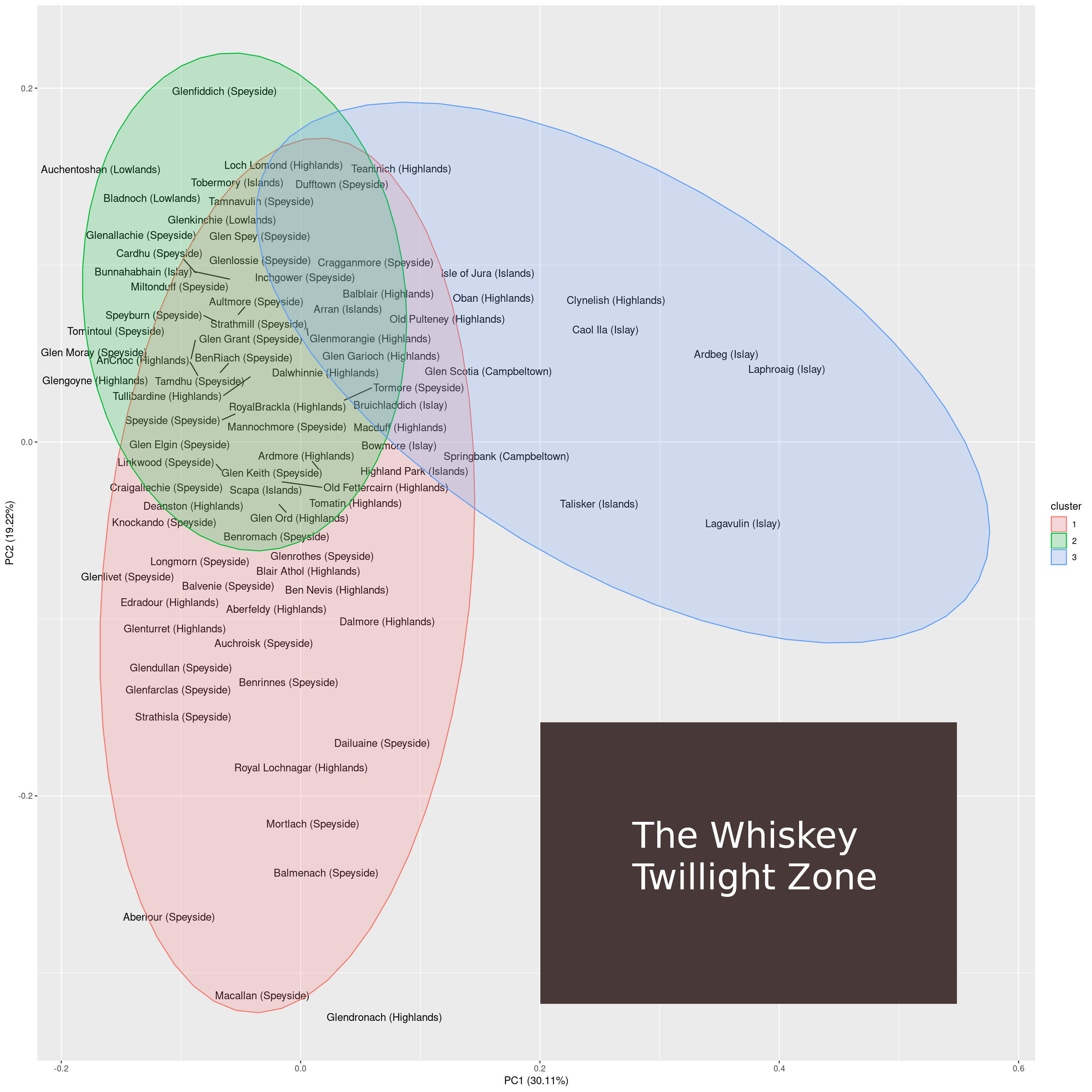
I find it interesting that the two-dimensional projection of whiskeys contains large open areas. This could indicate one of two things:
- There is still a lot of potential for experimenting with new, exciting types of whiskeys.
- There are just so many combinations of taste that are possible and go well together.
I am inclined to go with the second option. Why? In the PCA plot, the lower right is the largest region in which no samples reside. Looking at the whiskeys that come close to this region, we find that those are Macallan on the y-axis and Lagavulin on the x-axis. Macallan is known for its complex taste and Lagavulin is known for its smoky taste.
A whiskey that comes to lie on the lower right of the 2-dimensional PCA space would have both properties: it would be complex and smoky at the same time. I guess that a whiskey exhibiting both characteristics would be just too much for the palate to handle (i.e. smokiness masks complexity).
This unexplored region of taste can be considered to be the whiskey twilight zone. Regarding the twilight zone there are two questions. First, would it be possible to produce whiskeys to fill that void and, second, and probably more important, how would these whiskeys taste?
Whiskey twilight zone


Comments
There aren't any comments yet. Be the first to comment!